Analytics Dashboard Design
Designing a Data-Driven Monitoring Interface
Overview
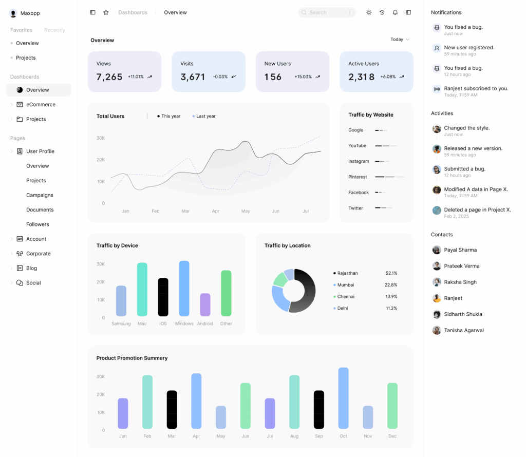
This project focuses on designing a comprehensive analytics dashboard that delivers real-time performance insights, user metrics, and activity tracking within a single, structured interface. The goal was to create a system that allows users to monitor key statistics, identify trends, and take action quickly — without cognitive overload.
The dashboard aggregates live data such as views, visits, new users, active users, traffic sources, and activity logs, presenting them in a clear, modular layout.
Objective
To design a dashboard that:
Displays key metrics at a glance
Tracks user activity and system updates in real time
Segments traffic by device, platform, and location
Enables high-level monitoring with drill-down capability
Maintains clarity despite large data volumes
Key Metrics Displayed
Today’s Live Data:
Views: 7,265
Visits: 3,671 (-0.03 change)
New Users: 156 (+15.03%)
Active Users: 2,318 (+6.08%)
Each metric includes visual trend indicators to support rapid interpretation of growth or decline.
Information Architecture & Layout
The dashboard is structured into modular panels:
1. Overview Panel
Highlights primary metrics and year-over-year comparisons using line graphs and trend indicators.
2. Traffic Segmentation
By Device: Samsung, Mac, iOS, Windows, Android, Other
By Location: Mansarovar (52.1), Mahesh Nagar (22.8), Surya Nagar (13.9), Raja Park (11.2)
Charts are placed logically side-by-side to support comparative analysis.
3. Activity & Notifications Feed
A time-stamped feed tracks actions such as:
Bug fixes
Style changes
New registrations
Version releases
Subscriptions
This supports operational transparency and traceability.
4. Projects & User Tracking
Total Projects: 30,000
Platform distribution: Google, YouTube, Instagram, Pinterest, Facebook, Twitter
Monthly tracking (Jan–Dec) for engagement patterns
Design Principles
Clarity
Large, bold headline metrics guide attention first. Supporting data is visually secondary.
Hierarchy
Whitespace and segmentation reduce clutter and support scannability.
Visual Consistency
Color-coded panels and trend arrows provide instant feedback.
Interactivity
Clickable filters
Hover states
Custom time ranges
Default / Favorites / Recent dashboard tabs
User Experience Rationale
The dashboard supports two types of users:
Executives – Need quick performance snapshots
Analysts / Teams – Need deeper data exploration
By combining summary-level metrics with drill-down capabilities, the design balances simplicity with analytical depth.
Accessibility & Responsiveness
The interface adapts across devices (desktop, tablet, mobile) and follows accessibility best practices through:
High color contrast
Legible typography
Clear iconography
Logical navigation structure
Outcome
The final dashboard design provides a clean, structured, and scalable monitoring system. It transforms complex datasets into actionable insights through thoughtful layout, segmentation, and visual hierarchy.
This project demonstrates my ability to design for data-heavy environments while maintaining usability, clarity, and strategic depth.