Single-Line Typeface Exploration
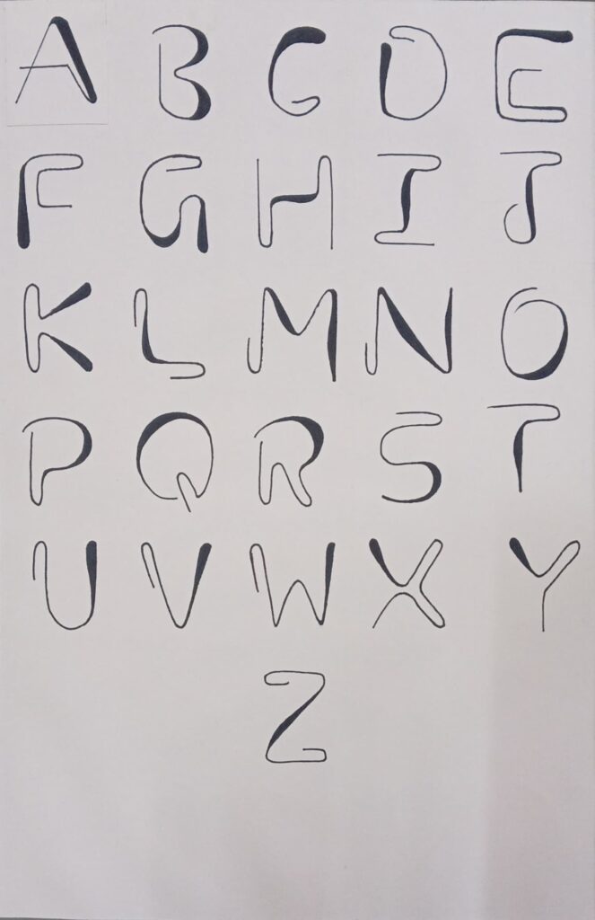
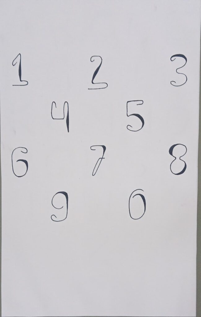
This project is a self-initiated type design exploration focused on constructing letterforms and numerals using a single continuous stroke. The objective was to reduce each character to its most essential structure while maintaining readability, rhythm, and visual balance.
The challenge of this typeface was restraint. By limiting the form to a single-line construction, I had to rethink traditional letter anatomy—stems, counters, curves, and terminals—into fluid, uninterrupted strokes. Each character was carefully sketched to preserve recognizability while exploring softness, asymmetry, and expressive movement. Slight variations in curvature and stroke weight were intentionally introduced to create personality without compromising clarity.
The alphabet showcases experimentation with open forms, rounded transitions, and minimal intersections, allowing the letters to feel organic and hand-crafted. The numerals follow the same philosophy, maintaining consistency in flow and structural logic. Some characters push abstraction slightly, exploring how far simplification can go before legibility is affected.
This exploration helped deepen my understanding of typography fundamentals, including proportion, spacing, stroke continuity, and form simplification. Designing within constraints strengthened my problem-solving approach—each letter became a balance between geometry and expression.
The result is a minimalist, contemporary type concept that feels fluid, lightweight, and experimental. While currently in its exploratory phase, this project reflects my interest in type design and my ability to translate conceptual limitations into structured visual systems.