Coursera Website Redesign (French Localization)
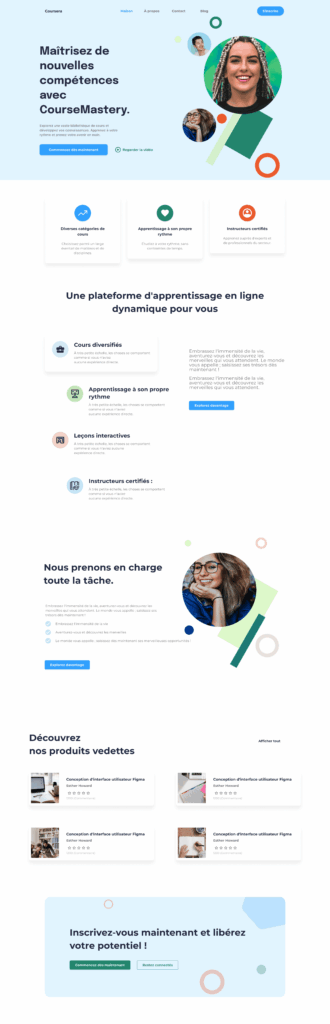
This project is a conceptual redesign of the Coursera homepage, reimagined in French and adapted to reflect the cultural nuances and aesthetic preferences of a French audience. Rather than simply translating the content, the focus was on cultural localization—ensuring that tone, visual hierarchy, and interaction patterns align with the expectations of users in France.
The redesign emphasizes clarity, sophistication, and balance. A soft blue-gray base palette combined with muted accent colors creates a calm and professional learning environment. French design culture often leans toward refined minimalism, structured layouts, and subtle visual depth; this is reflected through generous whitespace, consistent grid alignment, and understated geometric accents.
Typography plays a crucial role in conveying credibility and elegance. A clean sans-serif typeface was selected to maintain readability while supporting a modern academic aesthetic. Headlines such as “Maîtrisez de nouvelles compétences” and “Inscrivez-vous maintenant et libérez votre potentiel” are crafted to feel aspirational yet professional—mirroring the tone commonly found in French educational platforms.
The layout prioritizes intuitive scanning and structured content grouping. Feature cards clearly communicate course benefits, while the product showcase uses a balanced grid system for visual harmony. Call-to-action buttons are strategically placed and styled in a way that feels confident but not aggressive, aligning with culturally appropriate engagement cues.
Designed in Figma, this project demonstrates my ability to combine UX strategy, cultural research, visual hierarchy, and localization thinking. It reflects how thoughtful adaptation—beyond language—can create a more meaningful and resonant digital learning experience for a specific audience.